In summary:
- Define spaces with sensory cues like rugs and textures, creating “psychological walls” that are more effective than physical dividers.
- Select furniture with low visual weight—think slim legs and light colors—to maintain a sense of openness and light.
- Prioritize clear pathways (“flow choreography”) over cramming in more furniture to eliminate daily frustration and make the space feel larger.
- Utilize vertical space with wall-mounted storage to free up precious floor area and create visual breathing room.
Living in a studio apartment often feels like a compromise. Your dining table is your desk, your living room is your bedroom, and your bed is three steps from the dishwasher. It’s a single, continuous space where every function bleeds into the next, making it difficult to ever truly switch off. The pervasive feeling is that you live in a box, not a home. The standard advice often involves bulky bookshelves or flimsy folding screens that chop up the space and block precious light, making the studio feel even smaller.
But what if the most powerful walls aren’t physical at all? The secret to truly transforming a studio lies not in building barriers, but in mastering the art of sensory zoning. This architectural approach uses subtle cues—texture, light, sound, and defined pathways—to create psychological rooms. It’s about tricking your brain into perceiving separation and order where there are no walls, allowing you to mentally transition from “work mode” in your office nook to “relax mode” on your sofa, even if they’re only a few feet apart.
This guide moves beyond generic tips to provide a strategic framework for spatial design. We will explore how to select furniture that creates openness, choreograph traffic flow to avoid daily frustrations, and leverage every vertical inch to reclaim your floor. By implementing these principles, you can carve out the distinct feeling of a one-bedroom home within your open-plan reality.
To see these principles in action and gather some visual inspiration, the following video tour offers a glimpse into a well-designed studio apartment in New York. It perfectly complements the practical strategies detailed in this guide.
The following sections break down the core strategies for effective studio zoning. Each part provides actionable advice to help you reclaim your space and create a functional, serene home.
Summary: How to Create Distinct Zones in Your Studio Apartment
- Why Rugs Define Spaces Better Than Walls in Small Rooms?
- How to Select a Sofa That Doesn’t Dominate a 3-Meter Wide Room?
- Round or Rectangular: Which Dining Table Saves More Flow Space?
- The Layout Mistake That Makes You Bump Your Hip Every Day
- Going Up: Using Walls for Storage to Free Up Floor Space
- Why Is the Office Empty on Fridays and Overflowing on Tuesdays?
- Standing Desk or Balance Ball: Which Burns More Calories While Working?
- How to Build a “Clinoffice” (Closet Office) That Actually Feels Professional?
Why Rugs Define Spaces Better Than Walls in Small Rooms?
In a studio, physical dividers like screens or bookshelves often create more problems than they solve. They block light, interrupt flow, and make a small space feel claustrophobic. Rugs, however, create powerful psychological walls without any physical obstruction. They work on a sensory level, using color, texture, and even sound to delineate a zone. When you step from a cold hardwood floor onto a plush rug, your brain registers a change in environment. This is the foundation of sensory zoning.
Beyond visual definition, rugs provide crucial acoustic anchoring. Hard surfaces in a studio create an echo chamber where sound bounces freely, making the entire space feel like one loud room. A quality rug acts as a sound absorber. In fact, research from the Carpet and Rug Institute shows that carpets and rugs can achieve a 50-70% Noise Reduction Coefficient (NRC) rating, significantly dampening ambient noise. By placing a rug in your living area, you create an acoustic island of calm, subconsciously separating it from the clatter of the kitchen.

Layering rugs enhances this effect. A large, neutral jute rug can unify the entire studio, while smaller, more textured accent rugs can define specific “rooms” on top of it. A soft, high-pile rug under the sofa signals comfort and relaxation, while a durable, flat-weave rug under the dining table signals a utility space. This use of contrasting textures creates clear, functional islands that your mind interprets as separate rooms.
How to Select a Sofa That Doesn’t Dominate a 3-Meter Wide Room?
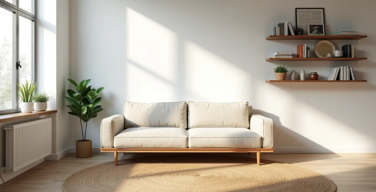
The single biggest furniture mistake in a studio is choosing a sofa that’s too visually heavy. In a narrow room, a bulky, dark-colored sofa that sits directly on the floor can feel like a solid wall, absorbing light and shrinking the perceived space. The key is to choose a sofa with a low visual weight, which means it appears lighter and occupies less psychic space, even if its physical footprint is similar. This creates essential visual breathing room.
Opt for sofas with tall, slender legs. Lifting the body of the sofa off the ground allows light and air to flow underneath, creating an illusion of spaciousness. Light colors—like beige, light gray, or pastels—reflect more light and recede visually, making them feel less dominant than dark, saturated hues. As a case study in effective design, designer Melissa’s 272-square-foot NYC studio feels larger because she used a light-colored loveseat on tall legs, which seems to float in the space and helps define the living area without overwhelming it.
The style of the arms also has a significant impact. Bulky, rolled arms can add 30cm or more to a sofa’s width without adding any seating. Instead, look for track arms (thin, straight arms) or an armless design to maximize seating in a minimal footprint. For multi-use studios, a modular two-piece sofa offers the ultimate flexibility to reconfigure the space as needed.
This comparative table highlights how different design choices impact the feeling of space in a small room.
| Sofa Style | Visual Weight | Space Saved | Best For |
|---|---|---|---|
| High legs + light color | Low | 20-25cm visual gain | Studios under 30sqm |
| Track arms | Medium-Low | 15-20cm per arm | Narrow rooms |
| Modular 2-piece | Flexible | Reconfigurable space | Multi-use studios |
| Armless design | Minimal | 30-40cm total | Micro studios |
Round or Rectangular: Which Dining Table Saves More Flow Space?
When every square centimeter counts, the shape of your dining table is not just an aesthetic choice—it’s a strategic one. While a rectangular table seems efficient, it introduces sharp corners that become “hip-bump zones” in tight pathways. A round table, by contrast, has no corners to jut out, allowing for smoother flow choreography around it. This is especially critical when the table is placed near a primary walkway, like between the kitchen and the living area.
Round tables are also more efficient for seating in compact areas. A rectangular table pushed into a corner instantly loses at least one seating spot. A round pedestal table, however, allows chairs to be tucked in neatly all the way around. By eliminating corner legs, pedestal bases offer superior flexibility for chair placement, and design experts note that pedestal base tables can provide up to 30% more usable seating for their footprint compared to tables with four legs. This makes them ideal for hosting guests without dedicating a massive area to dining.
To maximize visual flow, consider materials. A table made of glass or acrylic has almost zero visual weight, maintaining an uninterrupted sightline across the room. This gives you a fully functional dining surface without visually cluttering the space. For ultimate versatility, a drop-leaf or convertible console table can be folded against a wall for daily use and expanded only when needed, offering the best of both worlds: clear floor space and full-size dining capability.
The Layout Mistake That Makes You Bump Your Hip Every Day
The most common and frustrating layout mistake in a studio isn’t about the furniture itself, but the empty space *between* the furniture. We often focus on cramming in everything we want, forgetting that we need clear, comfortable pathways to move through the space. This creates “pinch points”—narrow gaps that force you to turn sideways or suck in your stomach just to get by. These daily micro-frustrations contribute significantly to the feeling of being cramped and disorganized.
Professional space planners follow a simple but non-negotiable rule to ensure proper flow. As outlined by Greystar, you should maintain a minimum clearance of 90cm (35 inches) for primary pathways you use constantly, such as the route from your bed to the kitchen or the bathroom. For secondary paths, like to a window or bookshelf, a clearance of 60cm (24 inches) is acceptable. Before placing any furniture, trace these routes on your floor plan and protect them.
A practical way to check your layout is the “laundry basket test.” Pick up a full laundry basket and walk your primary paths. If you can’t do it without turning sideways or bumping into furniture, your pathway is too narrow and needs to be widened. This might mean choosing a smaller coffee table, pushing the sofa back six inches, or even eliminating a piece of furniture altogether. Prioritizing clear, gracious pathways over an extra accent chair will make your studio feel exponentially larger and more functional.
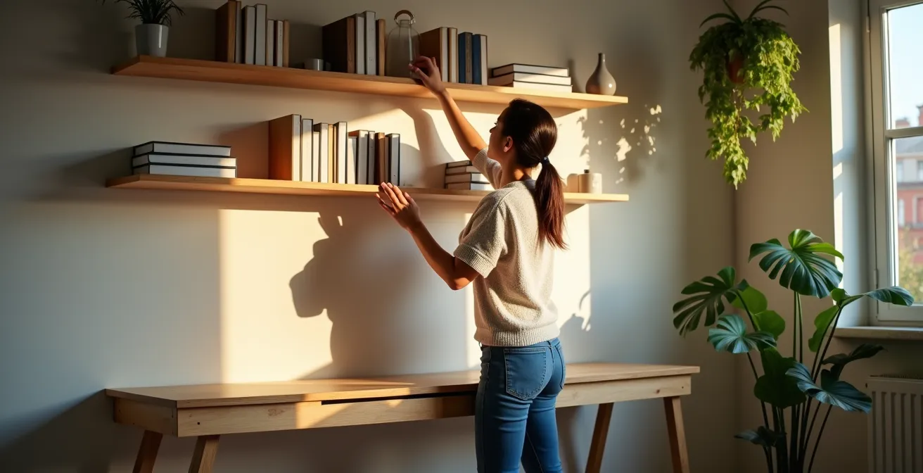
Going Up: Using Walls for Storage to Free Up Floor Space
In a studio, the floor is prime real estate. The single most effective way to make your space feel larger is to get things off the ground. Your walls are your most under-utilized asset. By embracing vertical storage, you can declutter your floor, create visual breathing room, and store everything you need in a way that feels intentional and organized rather than chaotic.
Think beyond eye-level shelving. The “top foot” of your walls—the 30cm space just below the ceiling—is perfect for perimeter shelving. This area is ideal for storing seasonal items, luggage, or anything you don’t need to access daily. It draws the eye upward, enhancing the sense of height, and keeps bulky items out of your immediate living zone. Another strategy is to float your furniture. Wall-mounting your nightstands, media console, and even your desk frees up the floor underneath, which creates an unbroken sightline that makes the room feel much more open.
Open-backed shelving units, like the IKEA KALLAX, can serve a dual purpose as both storage and a semi-transparent room divider. By filling the bottom half with attractive storage boxes for privacy and leaving the top shelves open or sparsely decorated, you can create a sense of separation while still allowing light to pass through. This strikes the perfect balance between zoning and maintaining an airy, open feel.
Why Is the Office Empty on Fridays and Overflowing on Tuesdays?
The rise of hybrid work has completely changed our relationship with physical workspaces, including the ones in our homes. Data on commercial office usage reveals a clear pattern: peak capacity on Tuesdays, Wednesdays, and Thursdays, with Mondays and Fridays being significantly quieter. Understanding this weekly rhythm is crucial for a studio dweller, because it means your home office doesn’t need to be a static, 9-to-5 monolith. Instead, you can design a flexible work zone that adapts to your personal hybrid schedule.
If you’re only in the office mid-week, your “work from home” days might be focused on deep work (Fridays) or light admin (Mondays). This doesn’t require a permanent, sprawling desk setup. As one case study on hybrid workers highlights, the key is a flexible strategy. Using furniture on casters, a fold-down desk, or a convertible console table allows your workspace to expand on busy days and shrink—or disappear entirely—on light days or weekends. This prevents your work life from visually and psychologically dominating your living space 24/7.
Staring at your bed all day is a known productivity killer. The goal is to create a clear workspace definition, even if it’s temporary. This could be a small desk in a quiet corner, oriented away from the bed and other distractions. Even a simple visual cue, like rolling out a specific chair or setting up a portable laptop stand, can signal to your brain that it’s time to work. The new rule for a studio office is agility: it should be fully present when you need it and completely invisible when you don’t.
Standing Desk or Balance Ball: Which Burns More Calories While Working?
While the calorie-burning debate between active work solutions is interesting, for a studio dweller, the more important question is: which one can I integrate without sacrificing my entire living room? The challenge is not just staying active, but doing so with equipment that has a minimal spatial footprint and high “stowability.” A giant balance ball, for instance, is notoriously difficult to store and becomes a permanent, awkward fixture in a small space.
The best active work solutions for a studio are those that can disappear. A standing desk converter sits on your existing desk or table, transforming it for work hours and leaving it clear when you’re done. A balance board is even better; with a slim profile of just a few inches, it can easily slide under the sofa or stand against a wall, looking like a piece of sculptural wood. These options provide the ergonomic benefits without the permanent clutter.
This principle extends to creating a “disappearing gym.” Your studio can easily house a full fitness routine if you choose equipment that is either beautiful or foldable. Resistance bands, a high-quality yoga mat, and even aesthetically pleasing wooden dumbbells can be stored in a dedicated “fitness drawer” or a stylish basket. The ultimate goal is dual-functionality: an ottoman that’s sturdy enough for box jumps, a balance board that looks like decor. This table compares options based on what truly matters in a studio: space.
| Option | Space Footprint | Stowability | Dual Function |
|---|---|---|---|
| Standing desk converter | Desktop only | Fully removable | Regular desk when lowered |
| Balance board | 60x40cm | Slides under sofa | Can be decorative |
| Ergonomic stool | 45x45cm | Tucks under desk | Extra seating |
| Balance ball | 65cm diameter | Difficult to store | Single purpose |
Key Takeaways
- Zoning is psychological, not just physical. Use sensory cues like texture, light, and sound to create distinct “rooms” without walls.
- Flow over furniture is the golden rule. A clear, comfortable pathway is far more valuable than an extra piece of furniture.
- Think vertically. Your walls are your most valuable and under-utilized asset for storage and for creating a sense of spaciousness.
How to Build a “Clinoffice” (Closet Office) That Actually Feels Professional?
The “cloffice” is the ultimate expression of studio apartment ingenuity: transforming a standard closet into a fully functional, professional-feeling workspace. This isn’t about just sticking a chair in a closet; it’s a design challenge that, when done right, creates a dedicated work zone that can be completely hidden away at the end of the day. It’s the perfect solution for separating work life from home life, both physically and mentally.
The key to a successful cloffice is overcoming the “cave effect.” This means maximizing light and creating a sense of depth. As professional designers have demonstrated, painting the closet interior a bright white, adding mirrors to bounce light, and installing bright, vertically-mounted LED strips at eye-level are essential to eliminate shadows and create a flattering environment for video calls. A curated backdrop using removable wallpaper and shallow floating shelves can make your cloffice look like a thoughtfully designed office nook, not an afterthought.
Ergonomics and functionality are paramount. A slide-out keyboard tray is crucial for maintaining a proper typing posture in a shallow space. To maximize the limited desk surface, use a clamp-on monitor arm to float your screen above the desk. This frees up valuable space for notebooks and other essentials. With the right planning, a cloffice can be more than just a novelty; it can be a comfortable, productive, and entirely discreet workspace that embodies the smartest principles of small-space living.
Essential Cloffice Setup Checklist
- Install bright LED strips at eye level to eliminate shadows on video calls.
- Add removable wallpaper or paint in light colors to prevent the ‘cave effect’.
- Mount a slide-out keyboard tray to maintain proper ergonomics in a tight space.
- Use a compact task chair or kneeling chair that fits the closet dimensions.
- Install sound-dampening foam inside the door for acoustic separation.
By applying these spatial strategies—from psychological zoning with rugs to the hyper-functionality of a cloffice—you can systematically transform your studio from a single, chaotic box into a well-defined, serene, and truly functional home.
Frequently Asked Questions About Studio Apartment Layouts
What’s the minimum walkway width I need between furniture?
You need 90cm (35 inches) for main paths you use multiple times daily, like from your bed to the kitchen. For secondary, occasional paths like to a window, 60cm (24 inches) is the minimum acceptable clearance.
How do I identify pinch points in my layout?
Walk your daily routes through your apartment with your arms slightly extended or while carrying a laundry basket. Anywhere you have to turn sideways, pull in your arms, or maneuver awkwardly is a pinch point that needs to be widened.
Should I prioritize open floor space or more furniture?
Always prioritize clear pathways first. A functional layout that allows for easy movement will make a space feel much larger and more comfortable than a layout that is crammed with furniture but difficult to navigate.